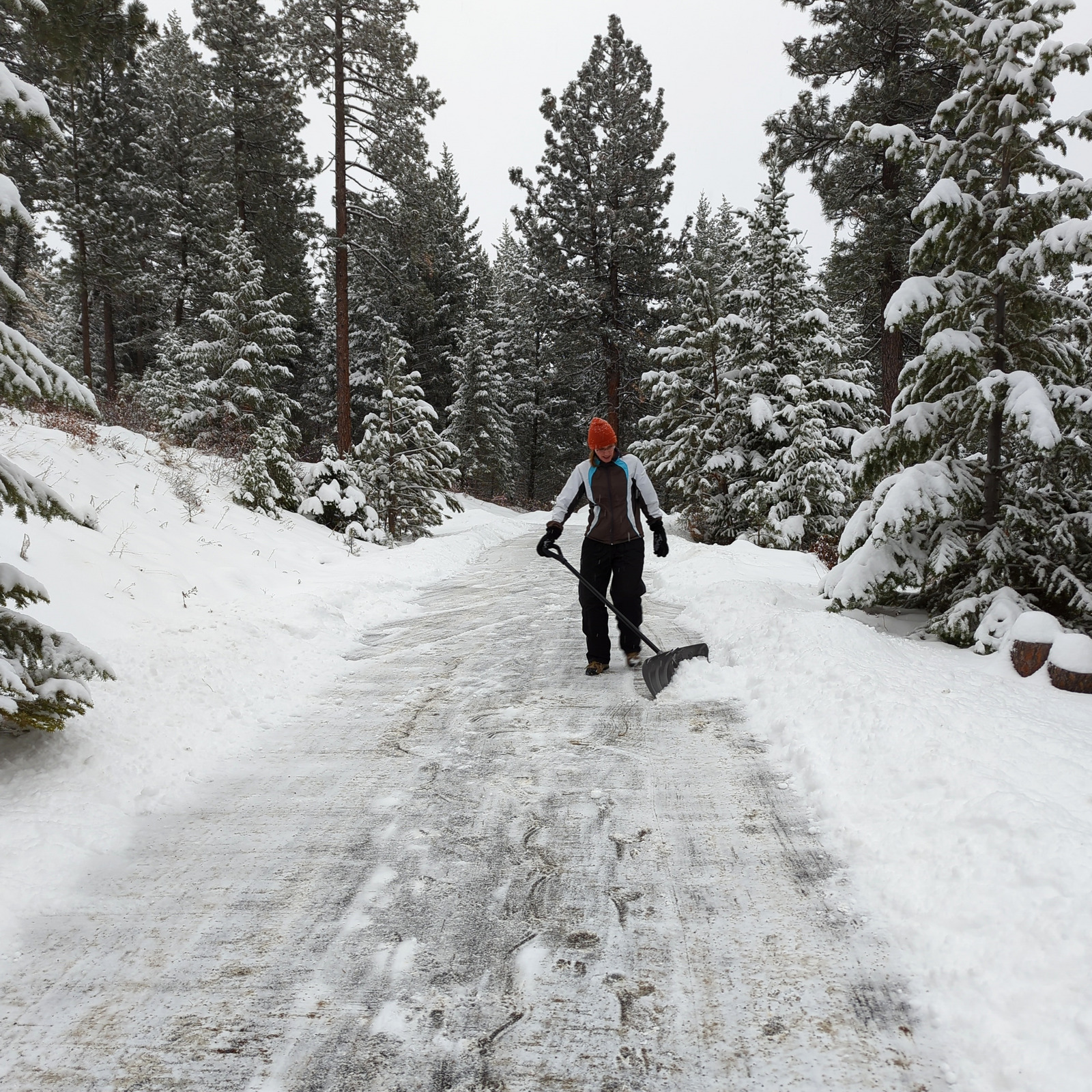
Here’s a sunset from two weeks ago.
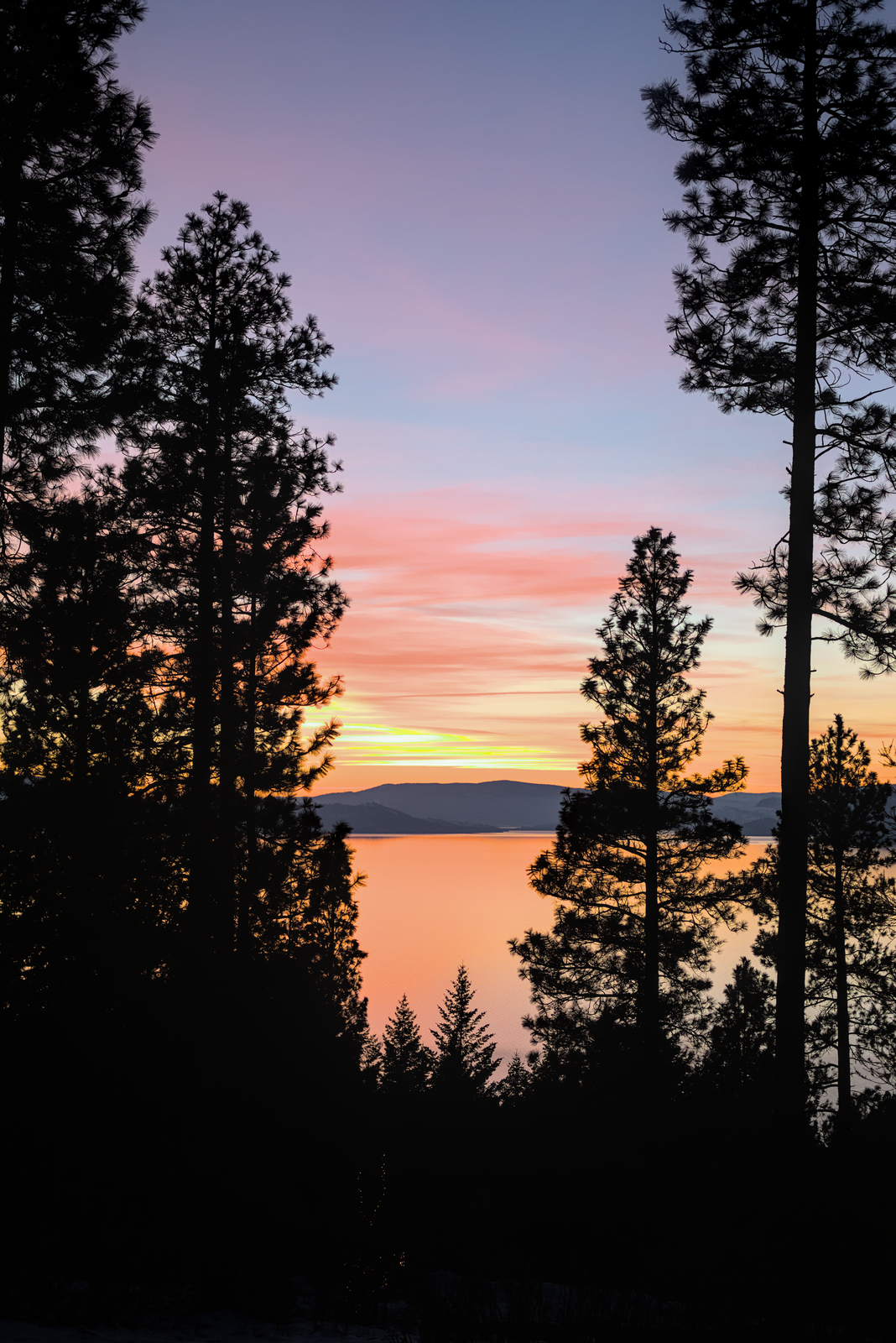
And here’s tonight’s sunset:
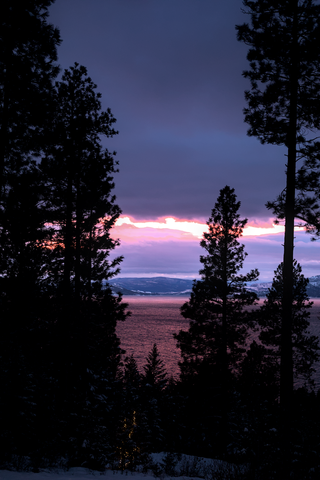
Sometimes funny, sometimes thoughtful, always a good time

Here’s a sunset from two weeks ago.

And here’s tonight’s sunset:

Our annual Christmas cards are the stuff of legend, and believe me when I say we get a lot of comments about them. People usually ask one of three questions:
My answers are usually along these lines:
This year’s card actually came together pretty quickly, which is either a sign that my creative skills are improving, or that I just didn’t want to spend too much time on it. As a result, our cards went out in late November– far earlier than usual! I’ve had the opportunity to hear from many people asking the questions above, and I decided I’d give my fans a little glimpse behind the scenes.
I should start with the inspiration for the card. Pepper really enjoyed Top Gun: Maverick and was excited to do something with that theme. After some quick research, it was clear we weren’t going to be able to fly in an F-18 like Tom Cruise did for the movie, so I turned to the movie poster. Here’s the official product:
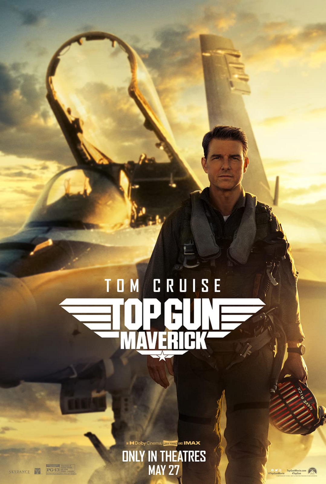
I definitely needed to include Pepper in the card, so I kept looking around the internet. I found a fan-made poster that would work:
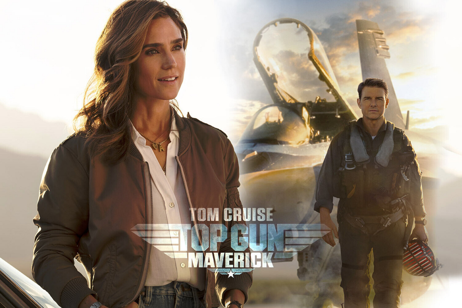
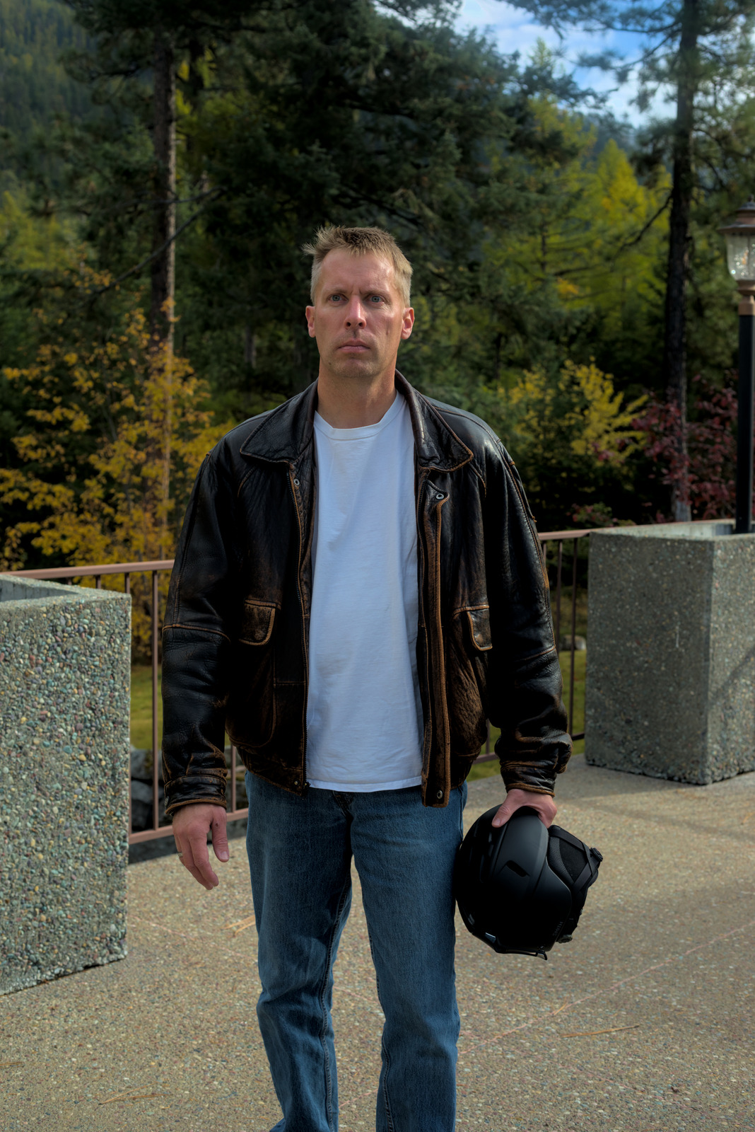
I’m pretty sure the shot of Jennifer Connelly is from a still frame late in the movie, but whatever… it’ll do. The next step was getting some photos of myself and Pepper that looked passingly similar. We put on some coats and stepped outside.

A close observer may notice that she’s wearing Harry Potter earrings (the Deathly Hallows) and a Hunger Games necklace (Mockingjay). Call it an Easter egg, if you will. As for me, I don’t have a flight suit, but Maverick did wear a leather jacket in both movies. And I have a ski helmet. Voila!
Wikipedia provided a nice shot of an F/A-18 Hornet on a carrier flight deck:
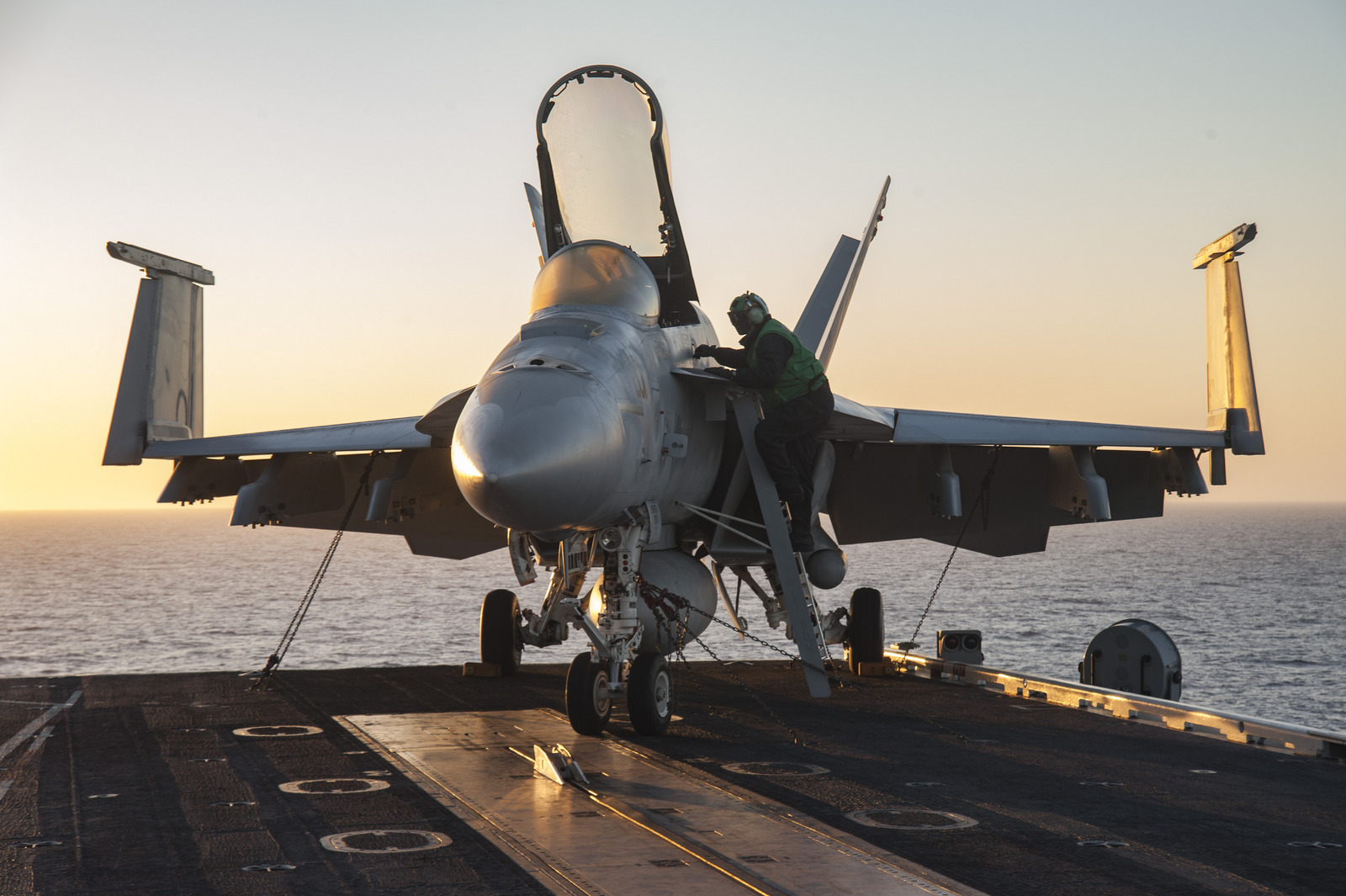
It took some work to remove the deckhand and make a few other slight modifications to the plane. I also needed a more interesting background, not only to match the movie poster, but also because the blank sky is boring. Cue a simple photo of some clouds:

I found some appropriate fonts to match the movie logo and poster. Bringing it all together, the card came to life:
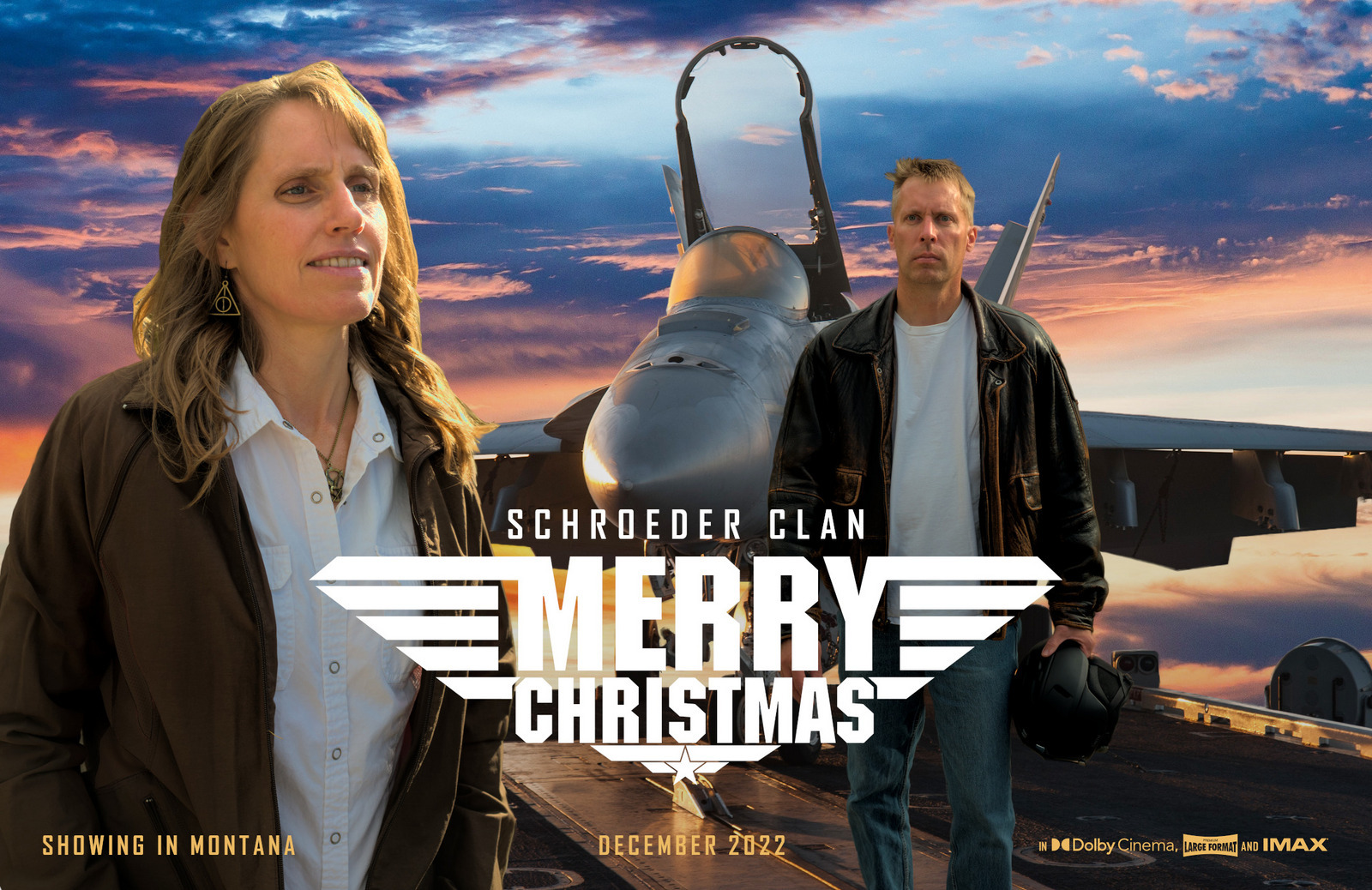
Often the devil’s in the details, though. The sunset shot required a bit more of an orange tint to everything. The cockpit had to show the clouds through the glass, while still looking like it’s glass and not simply missing. Pepper’s jacket needed to be edited to remove the pink sides. Shadows had to be adjusted. Edges were fuzzed so they don’t look like everything was cut out of a magazine and pasted together. I probably spent four hours working through all of this, but I’ve honed these little skills over the years, and I’m pretty pleased with the result.
In the grand scheme, stuff like this is probably child’s play for a serious graphic designer, but for a hack like me it’s not half-bad.
Of course designing the card is only the first step in the process. There’s the printing, envelopes and address labels, buying a ton of stamps, and eventually showing up at the post office with a box containing 330 cards (our new record). In a way I’m bummed that it’s practically an industrial process at this point; thirty years ago I was hand-writing about 30 cards. Now there’s not really any personalization in them. Still, they seem pretty popular with friends and family, so I continue the tradition…
As Pepper and I shoveled the six inches of snow along the 1,800 feet of our driveway this morning, she commented, “Is this what you thought retirement would be like?”
