
I was reading the New York Times and saw a graphic showing the current national unemployment level, which is 8.1%.
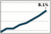
What the heck kind of graph is this? Without an x-axis there’s no way to tell if this is over the course of the last year, the last month, or maybe even since lunch. And without a y-axis we don’t know where it started– was there zero unemployment sometime recently that I didn’t know about?
Come on guys, I know not everyone is a mathematician like me, but really, can’t you do a little better than this?