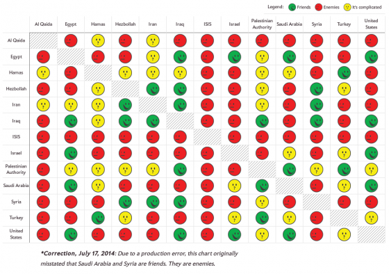
It’s a sad commentary on today’s world that so many countries and groups of people dislike each other we need some kind of “friendship chart” to understand the relationships. Not surprisingly, the Middle East is a prime example of this.
Slate just published this helpful friendship chart:
Note the legend in the top right: friends, enemies, and “it’s complicated”. I also can’t help but smile (in a sad way) about the correction at the bottom of the chart: the editors mistakenly thought two countries were friends, but alas they are not.
From experience with Kyra, I think this friendship-chart technology could also be used to help junior-high girls map their relationships with each other. So I suppose I’m saying, in the end, that the countries and groups in the Middle East are somewhat like a bunch of junior-high girls…

