
For a few years, my investments have been humming along. When I login to the brokerage portal, I get a nice graph of the money locked up in stocks. I check every month or so, just so make sure retirement is still on the table. For some reason, back in February the brokerage decided to add my mortgage debt to the graph. The result is sort of disheartening.
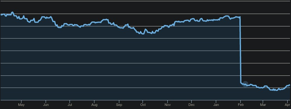
Now, instead of looking like a reasonable retirement plan, it looks like I’m setting myself up for failure. Hmm. Maybe it’s good to have this perspective, though?