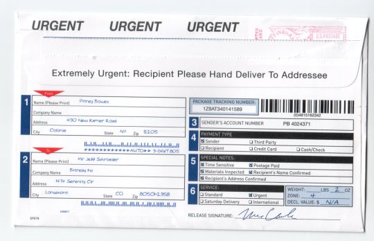
It’s a fact that the more complicated an envelope appears, the less valuable the contents will be. Here’s a great example from today’s mail:

Yes, I can see that it’s URGENT URGENT URGENT and Extremely Urgent and has all sorts of technical garbage like “Time Sensitive” and “Materials Inspected” and (wait for it) “Urgent”. It also has that oh-so-realistic handwriting font so I’ll think it was specially made out just to me.
I must point out that it was definitely not hand-delivered to addressee. I suppose I’ll have to talk to the mailman (a way cool guy who wears khaki shorts, Hawaiian shirts, and Birks). Clearly he’s ignoring the clear instructions on the mail he’s delivering. Slacker.
In the end, of course, this was just a ten-page ad for a postal scale. Wow.
