Today’s stupid web design note:
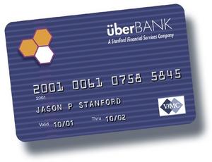
I’m so tired of using online payment for things– whether I’m ordering stuff or paying a bill– and having to fill out my credit card information without using spaces or dashes or whatever. Just a big old 16-digit number.
The reason? Because I have all my credit card numbers online (secure, yada yada) and I just cut and paste them as necessary, depending on what I’m buying and which company is paying for it. So I paste the number into the field, hit ‘submit’, and get barked at because the number isn’t formatted properly. Sigh.
Note to all web developers who think this is some kind of insurmountable problem: with about three lines of Javascript code, you can strip out anything that’s not a number and get what you need. For heaven’s sakes, guys, let consumers type dashes or spaces!
Pardon me, I have to go now and re-submit my information to T-Mobile so I can pay my phone bill…

