Yesterday I learned a new word: vexillology. It refers to the “scientific and scholarly study of flags”. Yeah, flags.
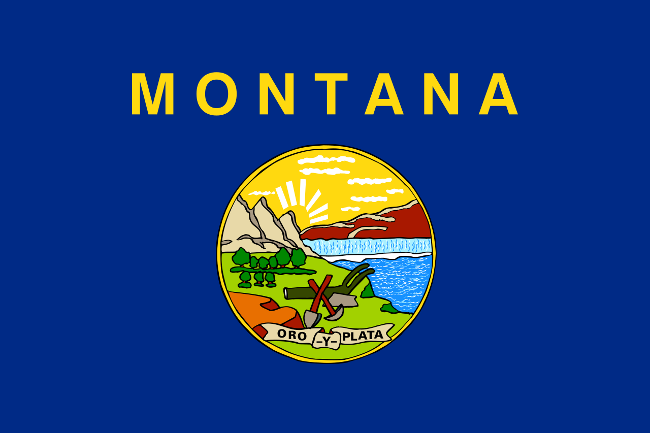
I learned it because Laralee asked what the Montana state flag looks like, and I showed her:

It’s, umm… something, isn’t it? It looks like it was drawn by a third-grader, which is either absolutely horrible or spectacularly fun. La was surprisingly annoyed by Oro y Plata, which is Spanish for “Gold and Silver” and apparently the state motto. Remember: despite what its license plates say, Montana is the “Treasure State”.
Back to vexillology. This flag was apparently ranked the third worst flag in the fifty states by the North American Vexillological Association. I can only imagine the meeting of NAVA where the members sat around discussing this, compiling a list of the fifty flags and arguing about which was really the worst. Georgia came in dead last, although they’ve since changed their flag (possibly due to the embarrassment of their NAVA ranking?). Nebraska’s flag was voted second-worst, and with a bit of reading I learned that in 2017 one of Nebraska’s state senators introduced legislation to redesign the flag, citing the fact that the flag had flown upside-down at the capitol building for over a week with no one noticing.
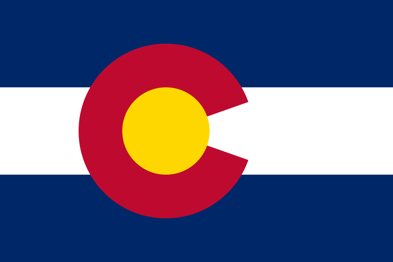
In the end, both Laralee and I agree that Colorado’s flag is pretty awesome. It’s simple, has no Spanish (or Latin) phrases, and has meaningful colors (sky, snow, sunshine, red earth).

Look at me, analyzing the flag… maybe I should become a vexillologist!
