
I think it was fifth grade when I took Missouri History class. It was one of those required classes in elementary school where you’d learn about, well, Missouri history, and take a few field trips to notable places. I remember the Daniel Boone home, and something about the start of the Lewis and Clark expedition, both of which were right at home in St Charles.
As part of that class, I distinctly recall having to draw the Missouri state flag. From far away it looks fine, but when you look closely at the Great Seal in the center, you realize there’s all sorts of madness for a fifth-grader to draw in crayon.
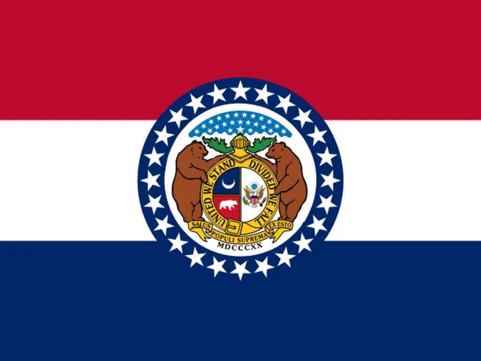
I’m confused about the presence of two huge bears, and the silhouette of a smaller one. Bears don’t seem to be a thing in Missouri. And there’s a crescent moon more reminiscent of the flags of Islamic countries than what you’d see in a warm summer night sky. It feels like someone threw in the great seal of the United States– a bald eagle holding an olive branch and arrows– as kind of an afterthought (“What should we put in this part of the seal? How about an eagle or something?”). There’s a bunch of Latin, mixed with English (held together with a belt buckle), and some Roman numerals for good measure. In short, it was a nightmare to draw all that when I was eleven.
About a decade later, I moved to Colorado, where they have a very sensible and easy-to-draw flag.
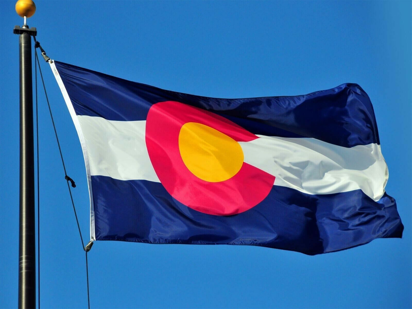
Moreover, the Colorado flag design can be used in all sorts of creative ways, because the big red “C” is quite distinctive and works for everything from window decals to sweatshirts. My kids always thought the Colorado flag was the best, and I’m inclined to agree.
A few decades after that, I find myself in Montana. I admit I don’t think I ever looked very closely at the Montana flag before moving here, but of course now that I’m here I see it everywhere.
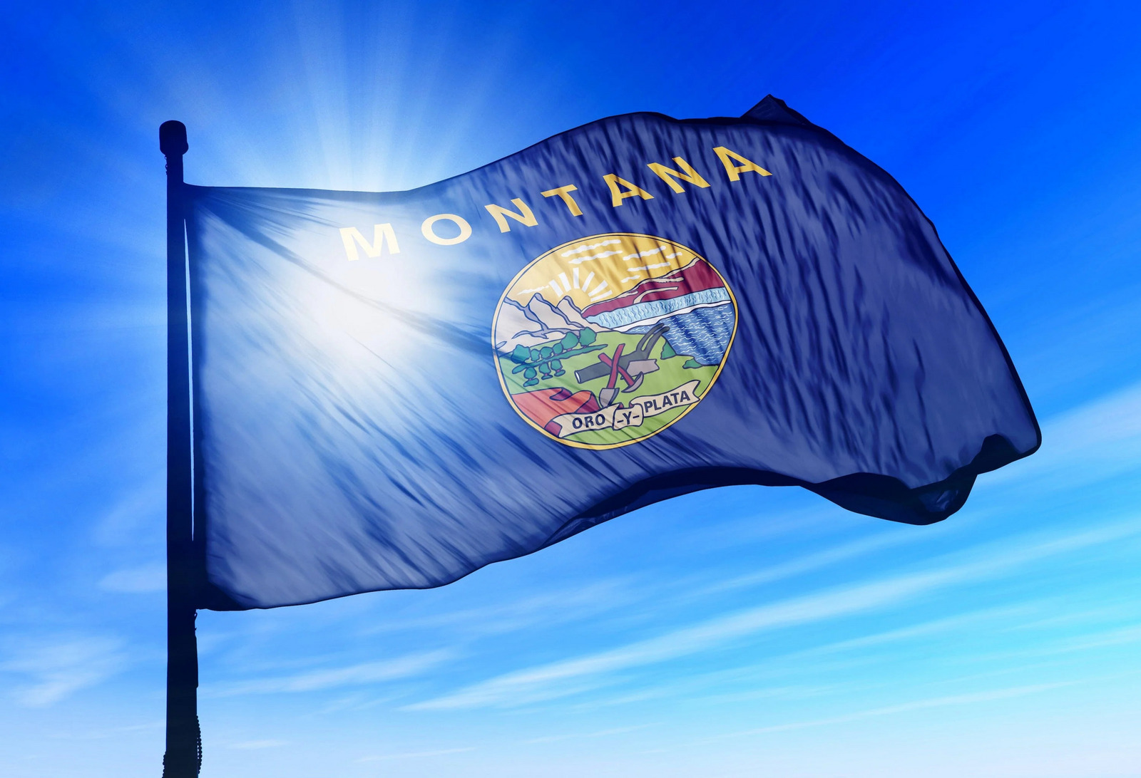
Flying majestically in a breeze, backlit by the sun, it’s not too bad. But then you look more closely, and it becomes kind of horrific.
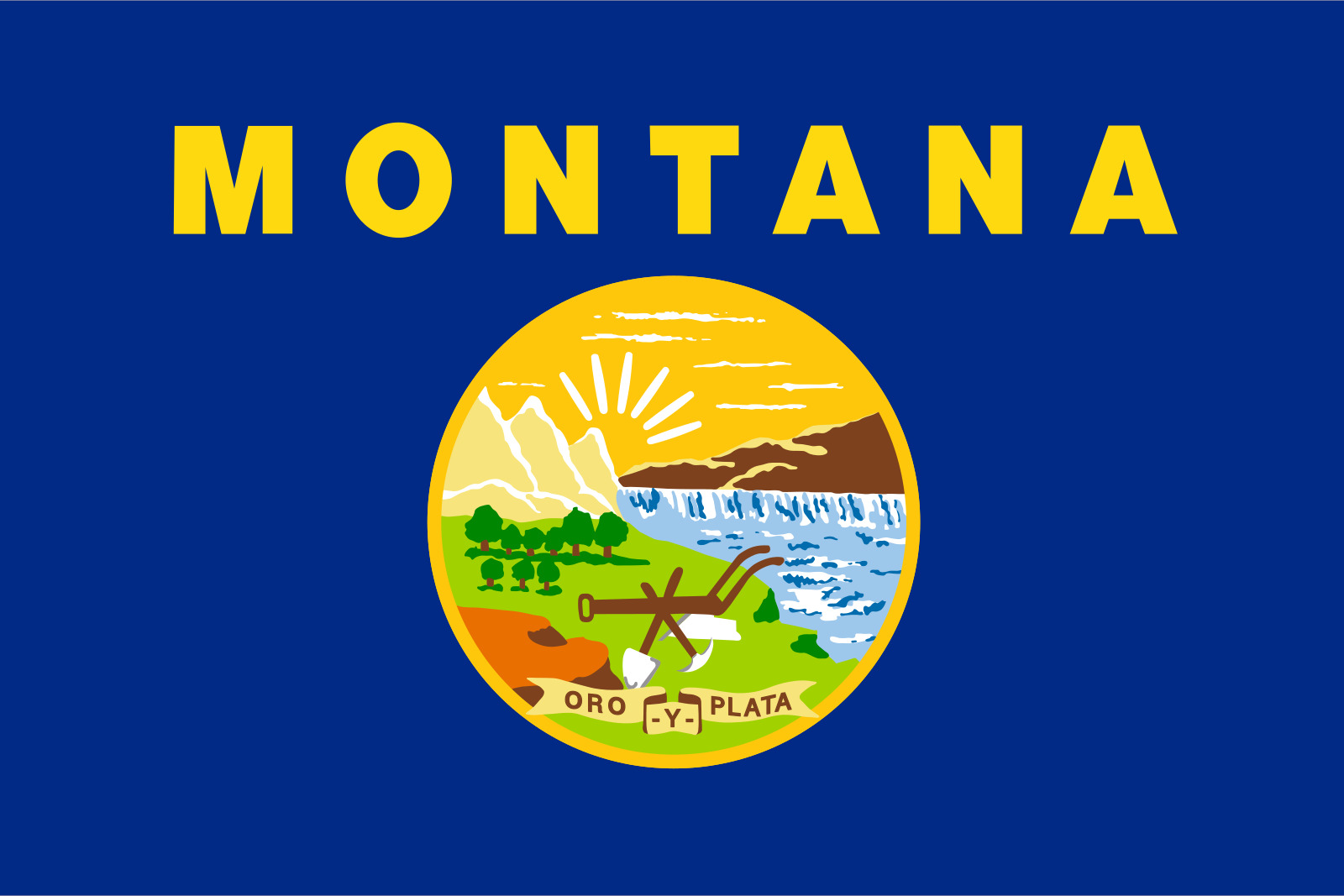
Let’s start with the font, which is basically something from the Helvetica Bold family. Nothing fancy here, no sir! It’s like the designers of the flag looked for the most boring font they could find. But it’s not really the font that kills me; it’s the design of the Great Seal of Montana. It literally looks like it was drawn by, well, a fifth-grader. “Oro y Plata”, or “Gold and Silver”, is kind of a silly motto, but whatever. The artwork shows mountains, a sunset, a waterfall and river, a copse of trees, some kind of plow device, and a shovel and pickaxe. I guess whoever came up with the idea felt like all of these things represented the state, but the execution of that idea is terrible. Really terrible. Montana’s flag is ranked as one of the worst in the Union. I even wrote about it four years ago, when we first moved here.
I’ve been over this ground before, but the point of today’s post actually concerns Minnesota’s state flag. Let’s take a look at it.
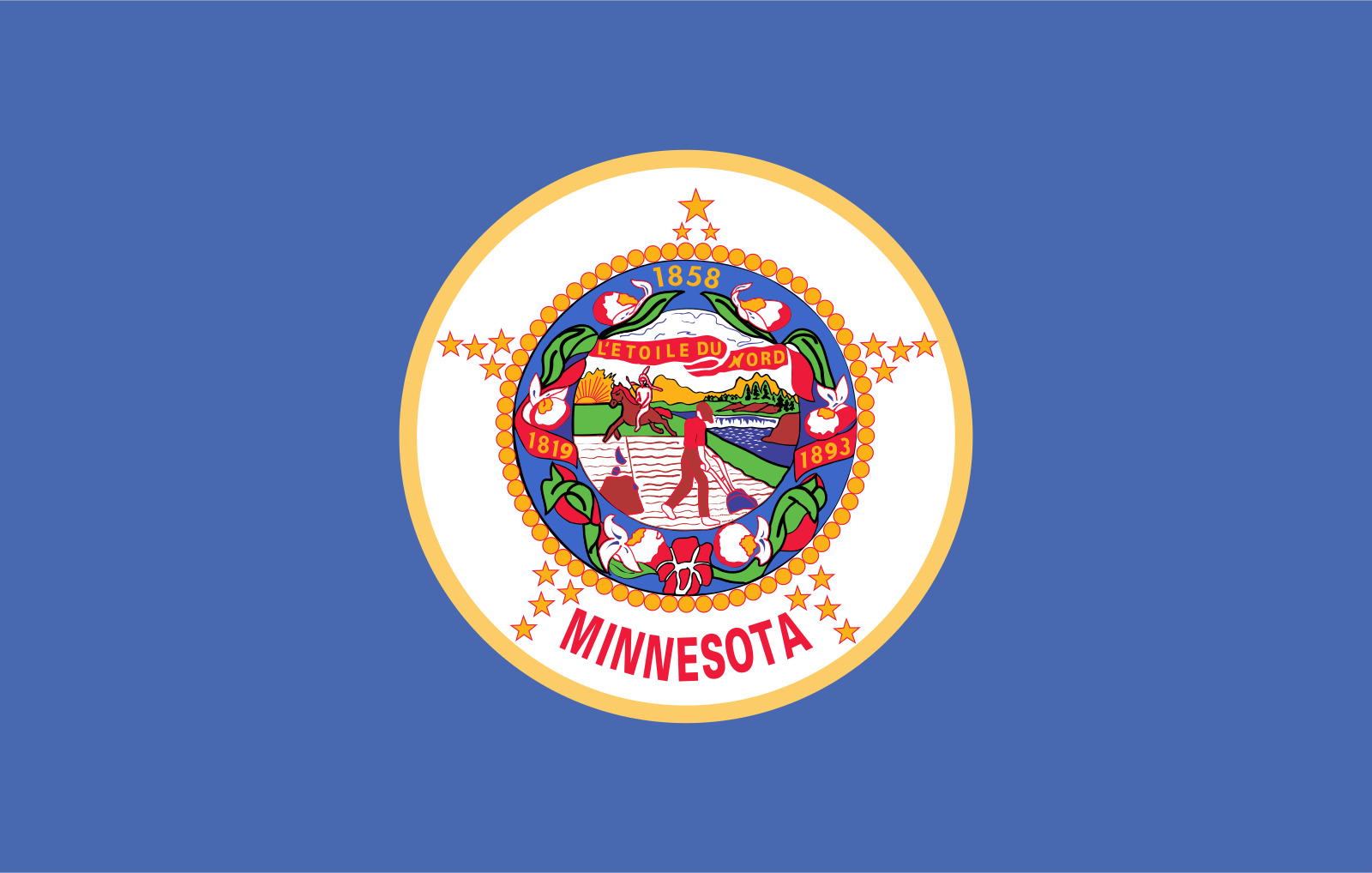
First, that blue is just a bad shade. It’s hard to describe why, but I think it’s because it’s not quite sky-blue, but not periwinkle either. It’s definitely not royal blue. And then, as I look more closely at the Great Seal of Minnesota, I can’t help but think it’s pretty much on par with the artistic level of Montana’s. There’s some guy plowing a field, that same waterfall and river we see in Montana, and apparently a Native American on horseback in the distance. Throw in a bunch of poorly-drawn flowers (or something) around all of it, add some circles and stars, more Helvetica Bold, and call it a day.
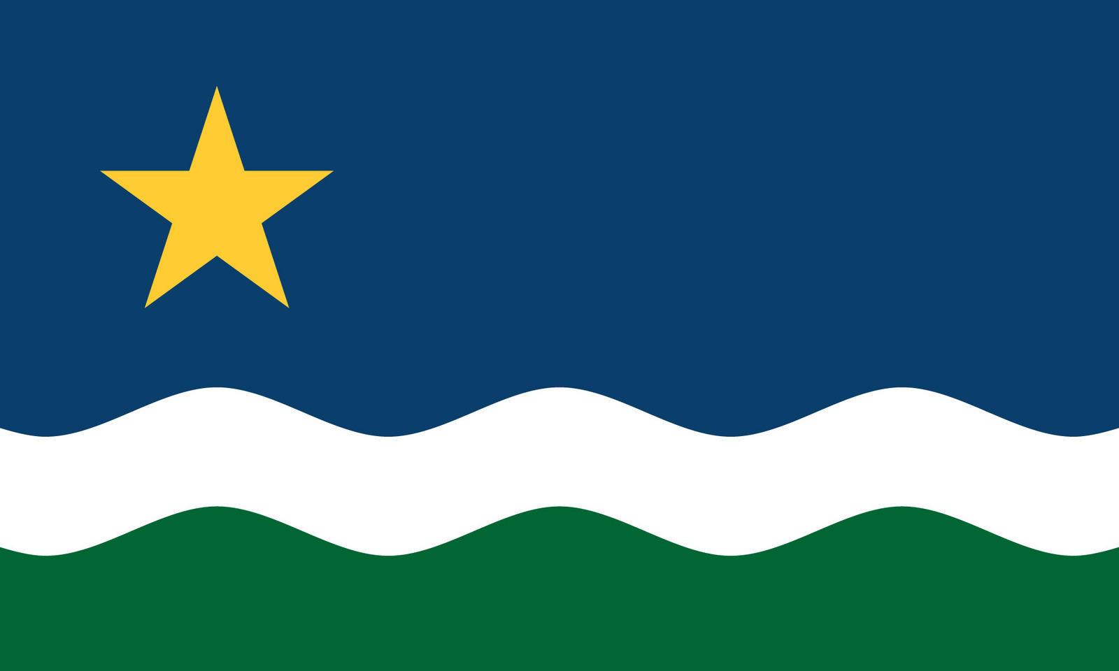
Well, apparently the government of the Land of 10,000 Lakes has decided it’s time for a change. They announced the start of a process to redesign the state flag, and– this is the best part– opened it up to the public via a web form. As you’d expect from the denizens of the internet, the designs have been pouring in. Many of them are fine. Here’s an example of one that’s pretty simple, although I’m not entirely sure what the various parts represent.
And while it’s heartwarming to see some six-year-old make a contribution…
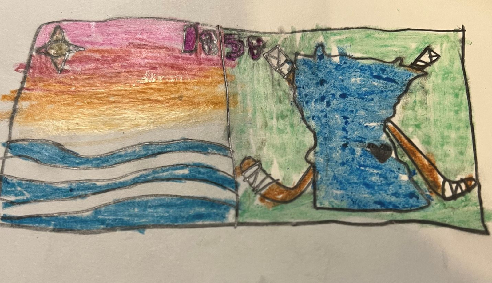
… there are just as many MS Paint masterpieces.

The creativity and graphic design prowess is definitely on display in a design like this:
Or this hot mess:
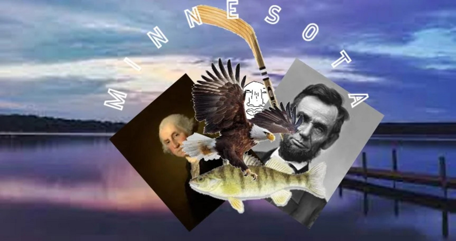
Let’s not forget the puzzled koi fish, whose mere presence on a Minnesota flag is puzzling in itself:

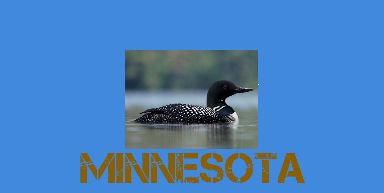
Perhaps one of the best designs is this one.

In the end, five of the public’s entries will be selected for final consideration by some legislative committee, who will then choose one to be the new Minnesota flag.
The point of all this meandering is that I really really wish the Montana legislature would follow Minnesota’s example and solicit a new design for our atrocious flag. I’d be happy to contribute…